
Website redesign · design and build

A clearer, sleeker home for free TV streaming

TCLtv+ is the free streaming service built into TCL Smart TVs. I redesigned its website in Figma and built it on Ghost, so it explains the service simply and helps people find something to watch.

Web designDevelopmentFigmaGhost CMSJan 2025
The challenge

A first-version site that undersold a free service

TCL is the world’s second-largest TV maker. Its first TCLtv+ website was an early version that didn’t look polished or make clear what the service was, or that it’s free. The new site had to work for streaming fans and for people brand new to smart TVs.

  • Match TCL's sleek brand
  • Make “free” obvious
  • Make channels easy to browse
  • Keep news easy to find
My role

Designed it, then built it

I took TCLtv+ from first layout to working website. I designed every page in Figma, then built the site on Ghost, a private dashboard where the TCLtv+ team posts news and updates pages. About 20% of the work was design and 80% was development.

Design

Every page laid out in Figma, from the homepage to the newsroom

Build

Coded in HTML and CSS on Ghost, which runs on Node.js

Easy updates

News posts and pages the team can update without a developer

FigmaGhost CMSHTML/CSSNode.js
Newsroom

News that keeps the site fresh

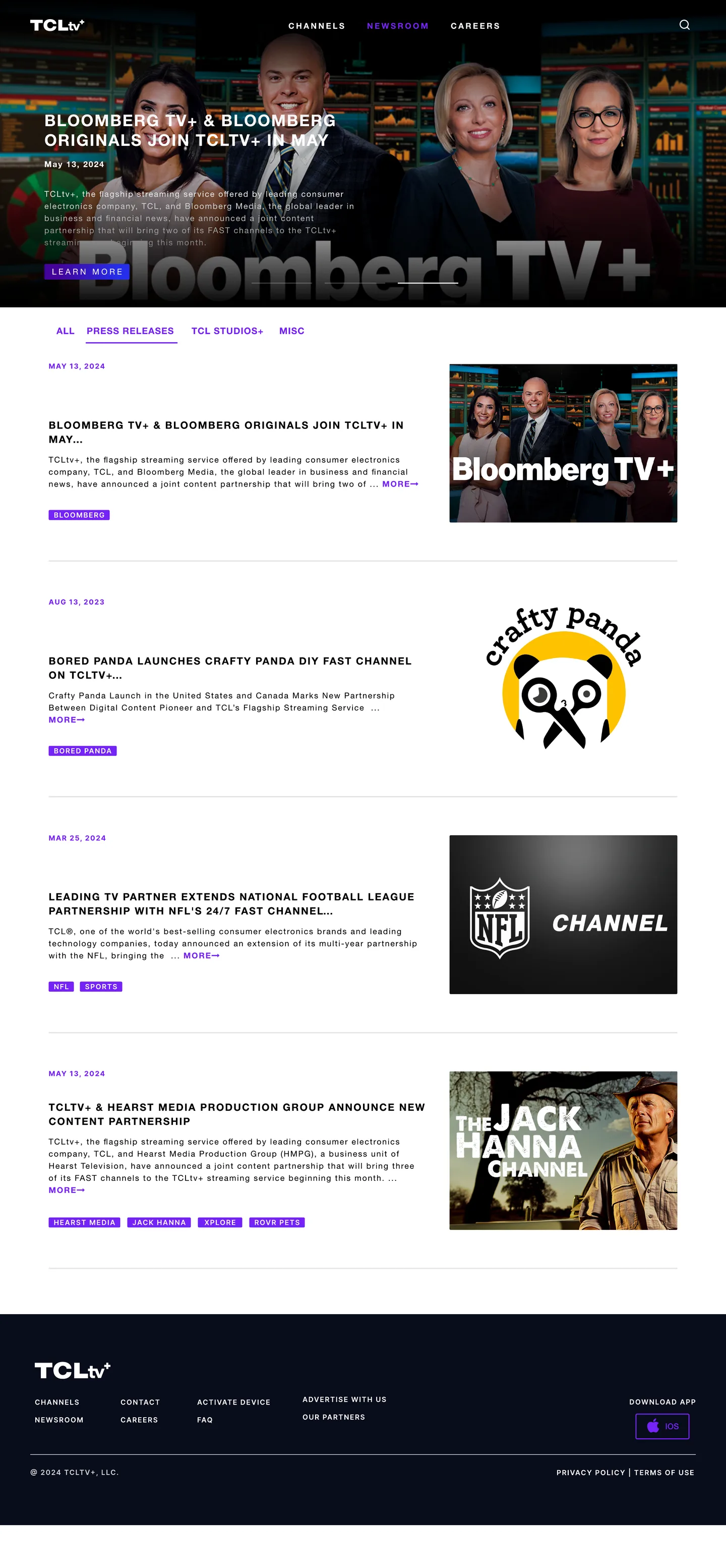
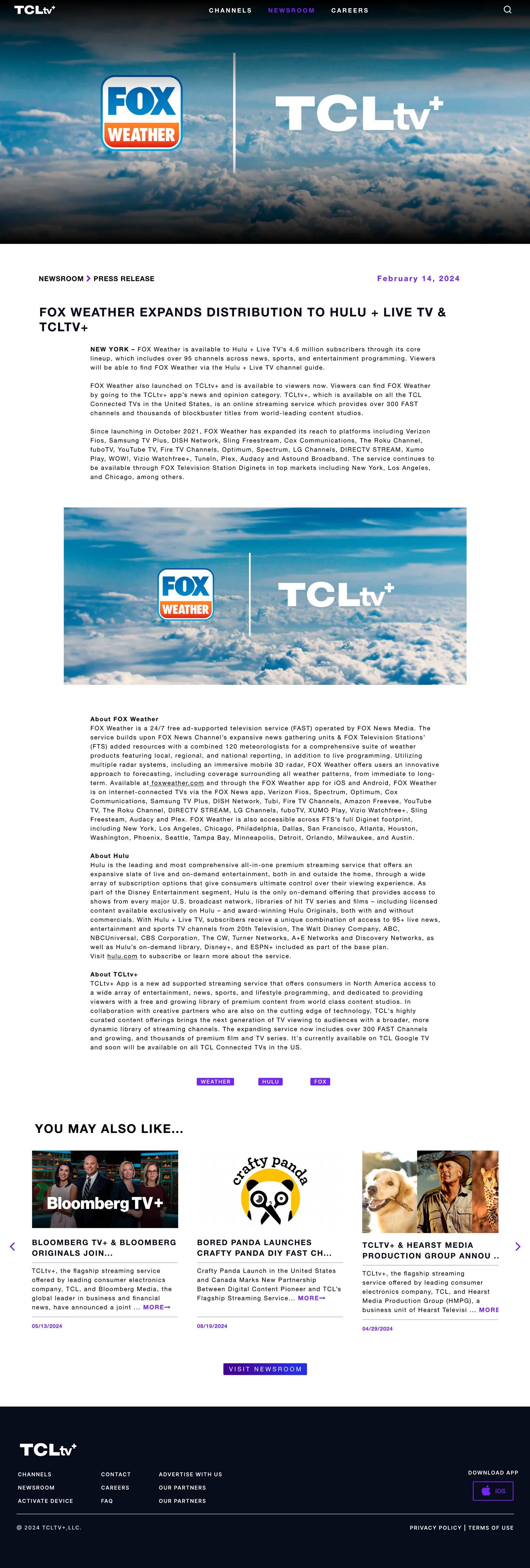
TCLtv+ adds new channels and partners often, so news has its own home. The newsroom shows the latest announcements first and filters them by Press Releases, TCL Studios+ or Misc. Every story ends with more stories to read next, which keeps visitors exploring.

Filter news by type
More stories at the end of every post
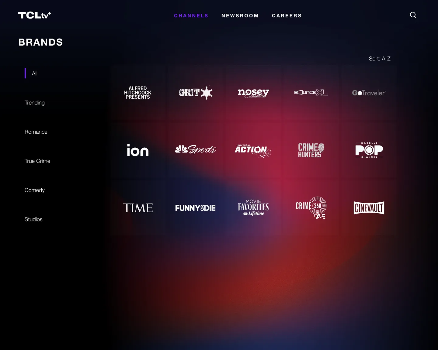
Filter by genre on the left
Every channel logo in one place
Channels

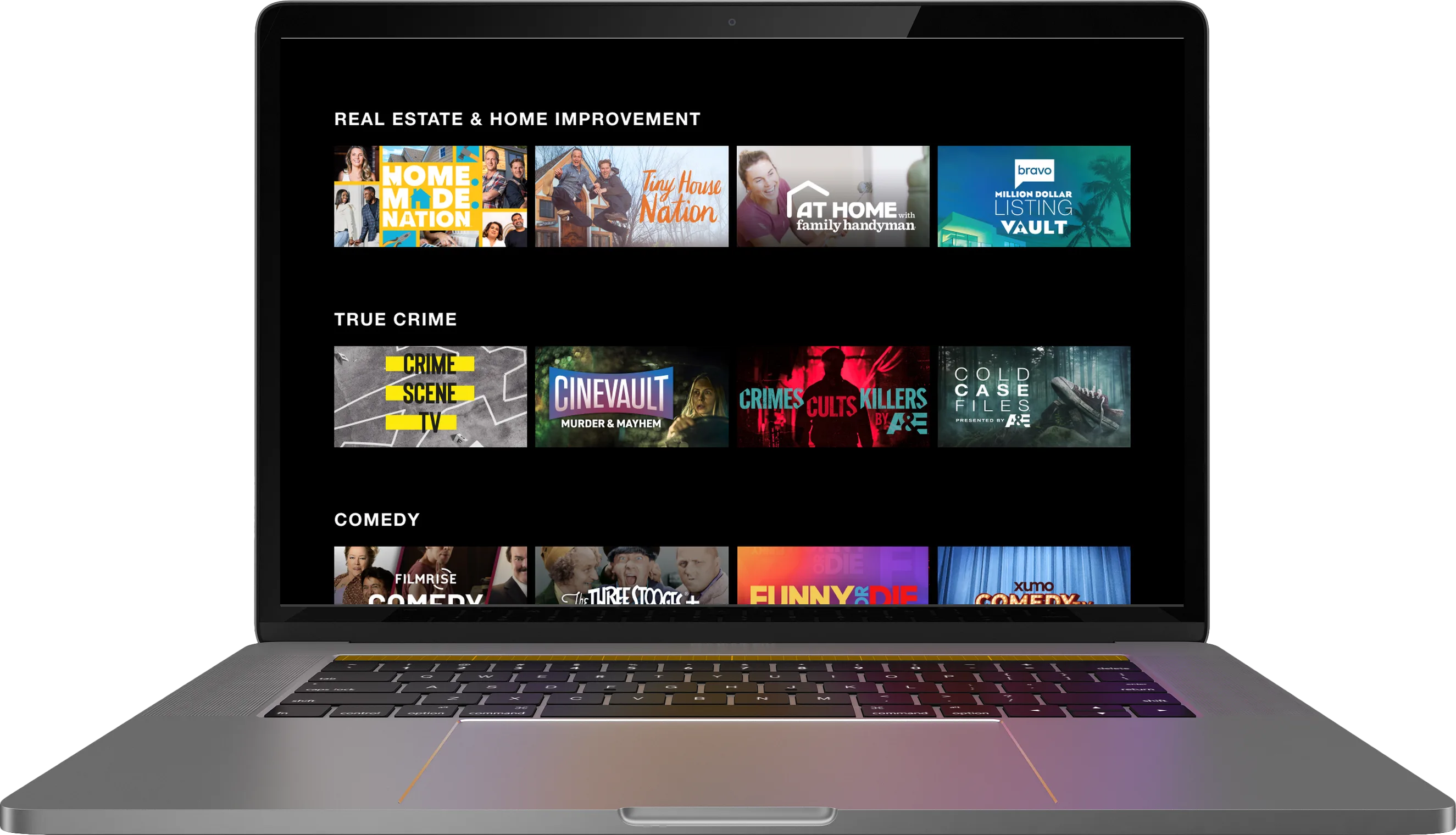
Browse every channel by mood or genre

The channels page puts every channel logo on one clean, dark page. A simple menu on the left filters the list by Trending, Romance, True Crime, Comedy or Studios, and channels can be sorted A to Z.

Before & after

From busy and red to calm and cinematic

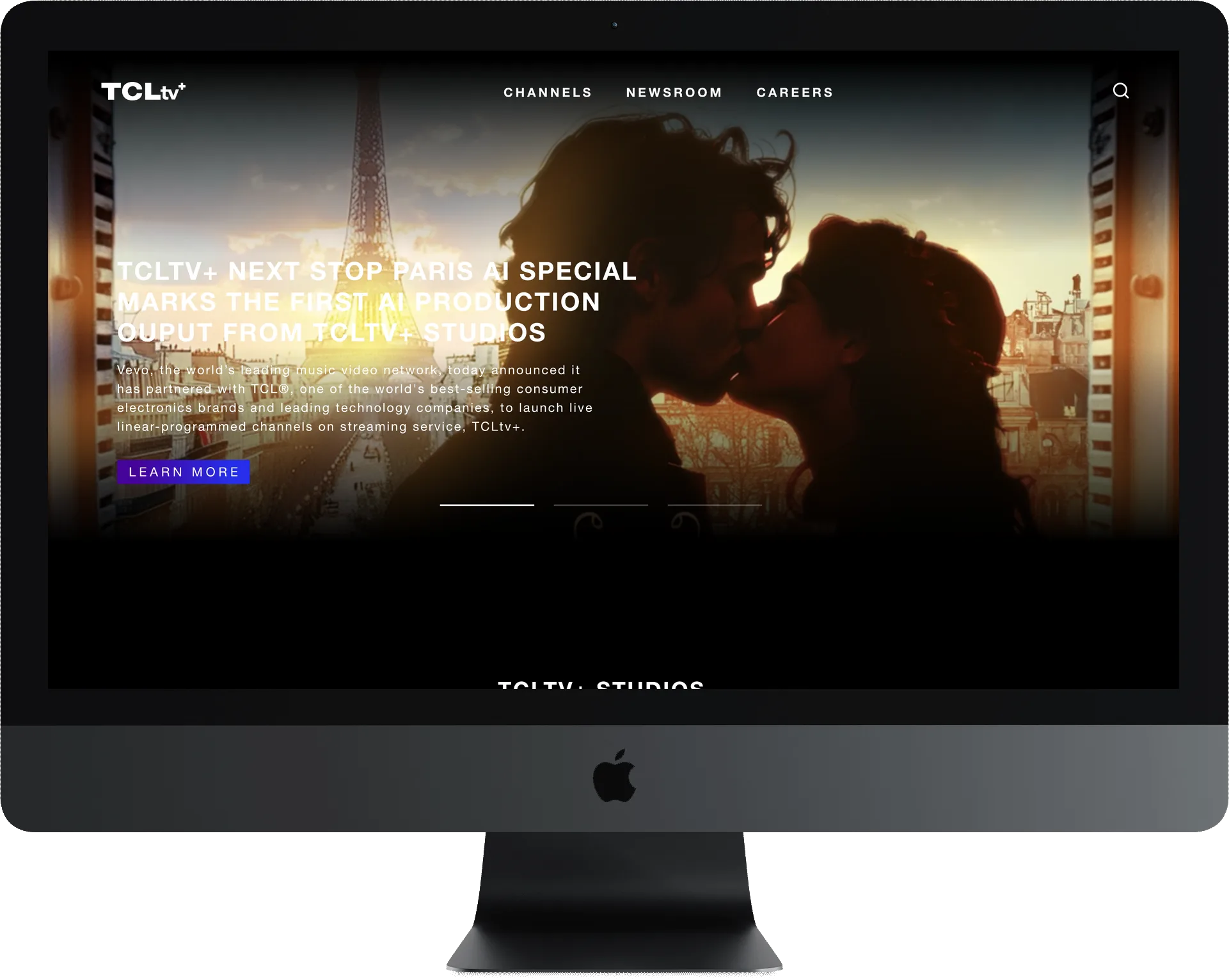
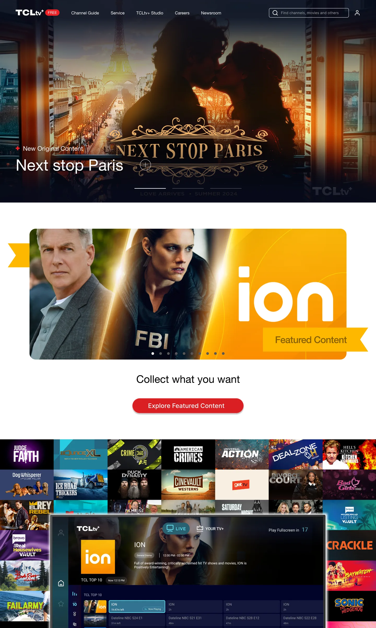
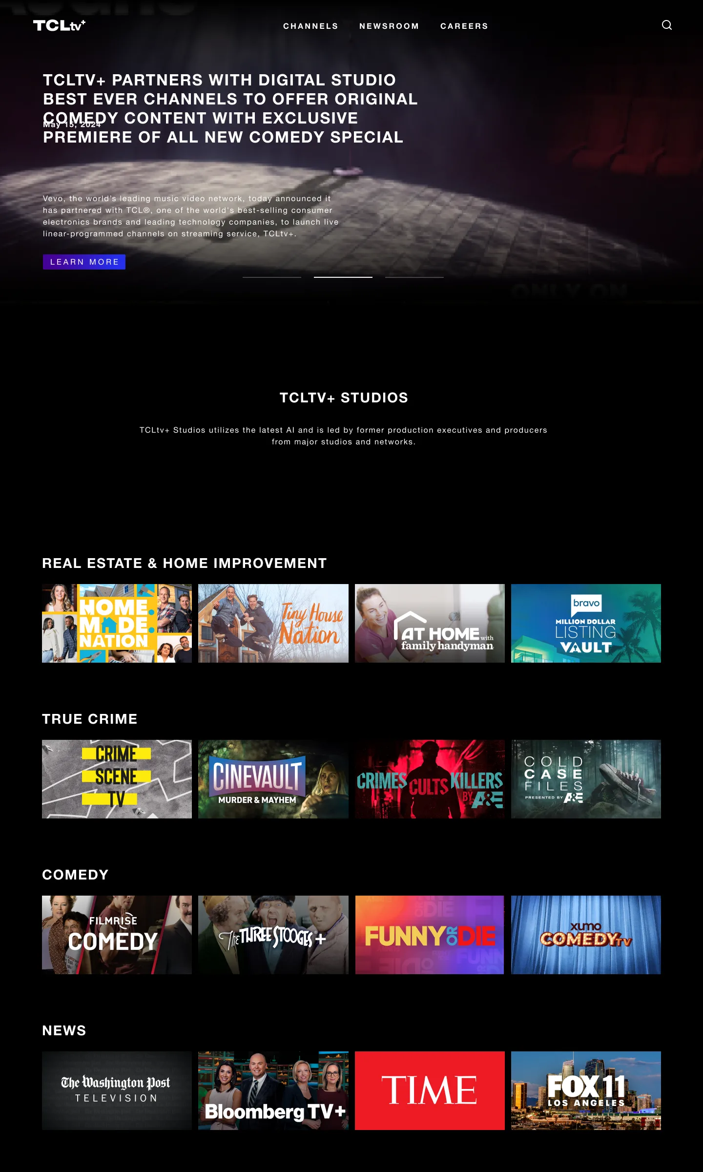
The original homepage used bright red buttons, several different styles and lots of competing sections. The redesign uses one dark, movie-theater look with purple accents, so the shows stand out and every button looks the same.

Before: original homepage

Many styles and bright red buttons competing for attention

After: redesigned homepage

One dark, calm look that lets the shows stand out

The result

A sleek site that explains free TV in seconds

The redesign gives TCLtv+ a polished look that matches TCL’s TVs, makes it obvious the service is free, and gives the team a simple way to keep channels and news up to date.

Why it matters for you: your customers shouldn’t have to work to understand what you offer. I design and build websites that explain things simply, then give you an easy way to keep them updated yourself.

Copyright © 2024 Michelle Prather Design Co.